Recently at Enquiro, I performed a private study for one of our clients who services both B2C and B2B customers with a fairly short consideration process. Because it was a private study, I am not at liberty to share the name of the organization, but I did want to share some of the findings, as I thought they might be of interest to you.
This was a fairly small usability study, consisting of 2 groups of 5 users. These users were prompted with either (1) a stripped back text based page with a selection of information, one text based and one simple graphical call-to-action or (2) a graphic intensive page, including engaging imagery, much more visual calls-to-action integrated into that imagery, and the same selection of information as the text based page and a video element.
Where we found the biggest difference, as indicated by the title of the article, was between the engagement on the page and the recall of information. It was expected that participants would be able to recall more of the information from the text oriented page, and this expectation was met, recalling 3 times as much specific information as those viewing the alternate graphic page.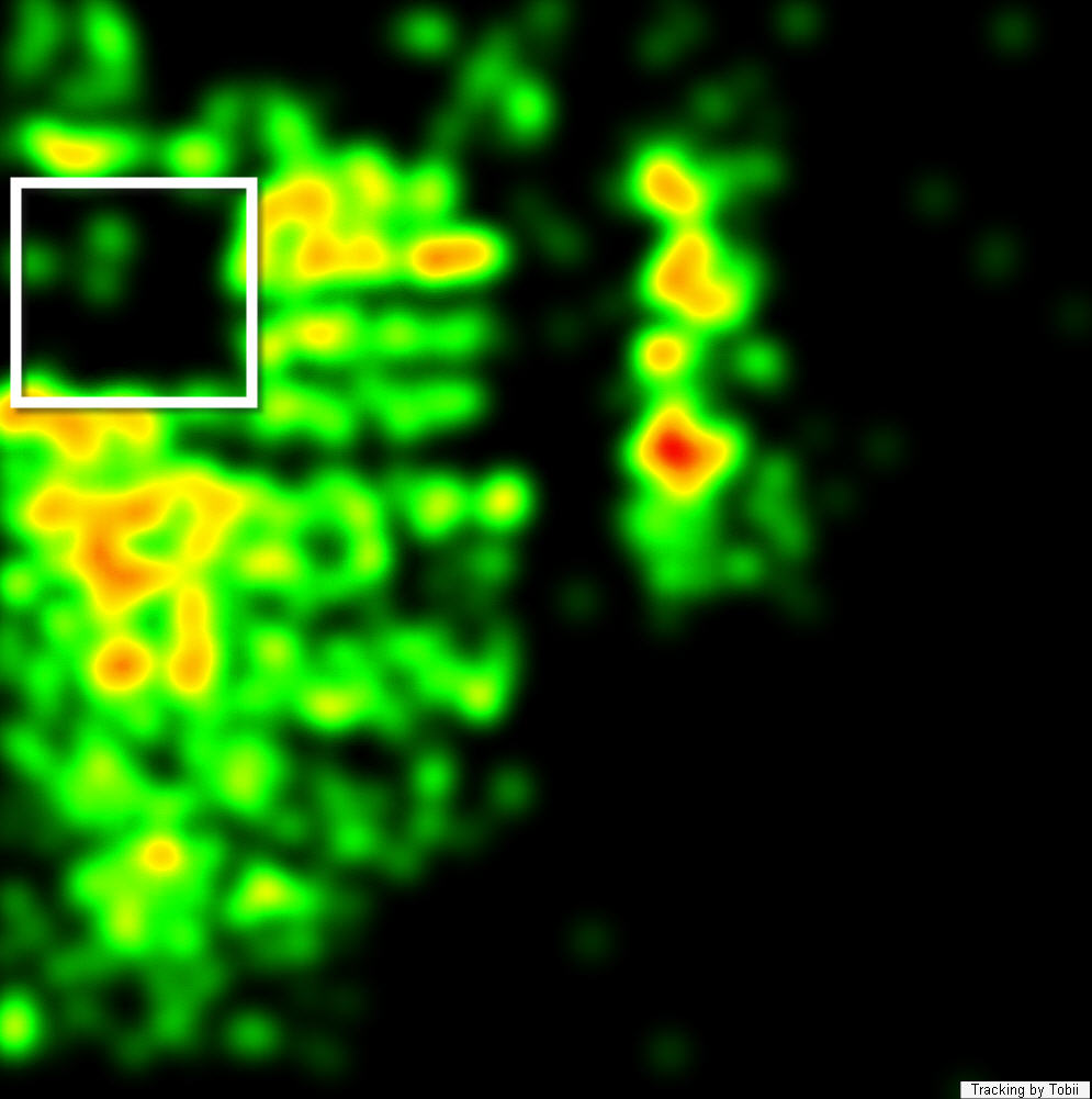 But this appeared to be where the benefits of the text based page ceased. As mentioned above, there was one simple graphical call-to-action on this page that, according to our eye-tracking of each of the participants, appeared to have performed like a fish out of water. This is indicated by the white box in the heatmap on the left. Instead of an attractant, this element acted to deflect the eyes of the participants, causing a banner blindness effect, even though the call-to-action fit well into the organization's look and feel.
What this shows is that each page has its own momentum, if you're going to give the user a primarily text based page, then design accordingly, by placing the calls-to-action inline and be sure that they are mainly text based themselves.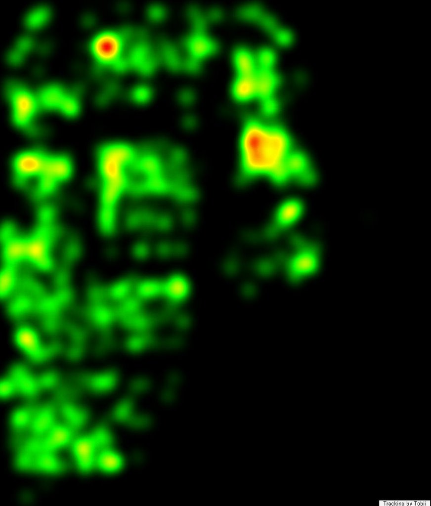 As for the Graphic based page, participants found it difficult to recall specific information after viewing the graphic based page, however, they did have a considerably higher impression and comfort level with it. They were more willing to visually explore each of the page areas, more willing to take it all in.
By reviewing actions on the page during the sessions as well as responses from an exit survey that were collected there was a considerable variation in the level of impression between both types of pages. When converting the likert scale to numerical values, the Graphic page scored a 29 out of a possible 35 when participants were asked to rate their level of comfort with submitting a quote on this site, as compared to a score of 23 for the Text based page. And when comparing how quickly and easily they felt they could have submitted a quote, the variation widened further, with the participants from the Graphic session scoring 30 out of 35 compared to 22 by the Text based participants.
The elements on the Graphic page struck a level of comfort with the participants, which, depending on who you talk to, is worth more to you than your customer remembering specific information. The participants from the Graphic page session took a feeling away with them, a feeling that they will associate with the brand going forward.
Specifically those participants who viewed the video embedded into the page. Which was a 30 second commercial spot, allowing the blend of offline and online marketing efforts to engage the potential customer. One of those participants even made a point of expressing specifically that she "felt they really care about me" after watching the spot. Not only that, but after viewing, she was far more willing to spend much more time on the site.
All in all, you can learn a little bit from everyone. In this case it really showed that, by beginning with the end in mind, your customer or potential customer can always leave with what's important to them. If it's facts, then display it like facts, if it's a feeling, then generate a feeling, just know what it is you want them to leave with, otherwise you might both be empty handed.
Friday, November 17, 2006
Engagement vs. Recall - Small Eye-Tracking Usability Study
![]()
Loading..
![]()
![]()
![]()
![]()
![]()
![]()
![]()
![]()
![]()
Subscribe to:
Post Comments (Atom)


1 comment:
Even though I'm reading this 2 years later, this is really interesting as I've been pondering engagement on sites like NotCot.com vs. Traditional More Text Based review systems.
So thank you for sharing!
If you have any other articles related to this please point in that direction!
Post a Comment